# Customizing themes

BTCPay Server is built on Bootstrap and offers the flexibility to adjust its look to your needs. Learn more about the standard design specifications used in BTCPay (opens new window).

# Built-in themes

BTCPay Server currently has several built-in themes available for server admins. Selecting a theme in Server Settings will modify the appearance of the entire server (for all users) without having to make any code changes or additional customizations.

BTCPay Server Theme

There are two other approaches to customizing the theme of your BTCPay Server.

  1. Developing a custom theme (requires technical skills)
  2. Using a pre-made Bootstrap theme (does not require technical skills)

# 1. Custom themes

This is the way we are building our own themes, like the Classic (opens new window) or Casa (opens new window) theme.

With this approach you provide a CSS file containing the variable definitions (CSS custom properties (opens new window)) to adjust colors, fonts, etc.

You should copy one of our predefined themes (opens new window) and change the variables to fit your needs. To test and play around with the adjustments, you can also use the developer tools of the browser: Inspect the <html> element and modify the variables in the :root section of the styles inspector:

Theme customizations

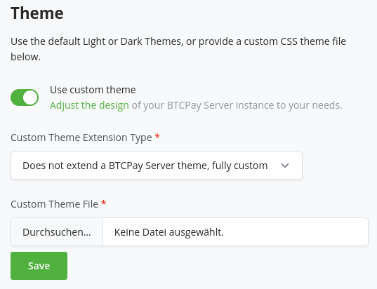
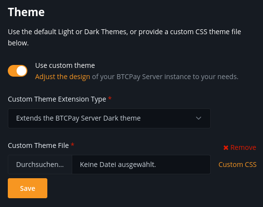
Once you are done with your modifications, you can upload and reference it in the "Custom theme CSS file" field.

Theme settings

# Developing and extending a custom theme

The BTCPay Server user interface is built on a customized version of Bootstrap that supports CSS custom properties (opens new window). This allows us to change theme related settings like fonts and colors without affecting the bootstrap.css. Also we can provide just the relevant customized parts instead of shipping a whole bootstrap.css file for each theme.

Take a look at the predefined themes (opens new window) to get an overview of this approach.

# Modifying existing themes

The custom property definitions in the :root selector are divided into several sections, that can be seen as a cascade:

  • The first section contains general definitions (i.e. for custom brand and neutral colors).
  • The second section defines variables for specific purposes. Here you can map the general definitions or create additional ones.
  • The third section contains definitions for specific parts of the page, sections or components. Here you should try to reuse definitions from above as much as possible to provide a consistent look and feel.

The variables defined in a theme file get used in the site.css (opens new window) file.

# Overriding Bootstrap selectors

In addition to the variables you can also provide styles by directly adding CSS selectors to this file. This can be seen as a last resort in case there is no variable for something you want to change or some minor tweaking.

# Adding theme variables

In general it is a good idea to introduce specific variables for special purposes (like setting the link colors of a specific section). This allows us to address individual portions of the styles without affecting other parts which might be tight to a general variable.

For cases in which you want to introduce new variables that are used across all themes, add them to the site.css file. This file contains our modifications of the Bootstrap styles. Refrain from modifying bootstrap.css directly – see the additional notes for the reasoning behind this.

# Adding a new theme

You should copy one of our predefined themes and change the variables to fit your needs.

To test and play around with the adjustments, you can also use the developer tools of the browser: Inspect the <html> element and modify the variables in the :root section of the styles inspector.

# Notes on bootstrap.css

The bootstrap.css file itself is generated based on what the original vendor bootstrap.css provides.

Right now Bootstrap (opens new window) does not use custom properties, but in the future it is likely that they might switch to this approach as well. Until then we created a build script in this repo (opens new window) which generates the bootstrap.css file we are using here.

The general approach should be to not modify the bootstrap.css, so that we can keep it easily updatable. The initial modifications of this file were made in order to allow for this themeing approach. Because bootstrap has colors spread all over the place we'd otherwise have to override mostly everything, that's why these general modifications are in the main bootstrap.css file.

The Bootstrap theme options are another approach of providing customizations, let's look at this next.

# 2. Bootstrap themes

Bootswatch (opens new window) offers lots of custom theme maintained by the Bootstrap community.

Bootswatch

Please note that this approach works best when used with the Classic theme described above.

If you want to change this theme, find a theme on Bootswatch (opens new window) which interest you, for example, Darkly (opens new window).

Copy the link of the theme:

CopyBootswatch

Now, go into the settings of your store and paste the link to customize the bootstrap theme:

ModifyBootstrap

And enjoy a new theme!

CustomTheme

# Checkout page themes

BTCPay Server checkout page can be customized to fit your branding.

Go to your Store Settings > Checkout Experience, and link to a custom CSS stylesheet.

Server admins can upload their .css file to File Storage to create a CSS stylesheet link.

Below are examples of businesses that use custom-made checkout themes.

# Andreas M. Antonopolous (opens new window)

Aantonop checkout
Made by: @artdesignbySF (opens new window) / artdesignbySF@protonmail.com

Click to view CSS

CSS file:

/*  ===========================CREDITS=========================== */
/*  Custom BTCpay Server CSS template made by @artdesignbySF.   */
/*  PLEASE CONSIDER DONATING BITCOIN IF YOU FIND          */
/*  THIS FILE USEFULL: 3LBQbv72rdSrLmFF66p9gMPDuPMcKL7UL1     */
/*  Follow @artdesignbySF on Twitter                */
/*  Contact via: artdesignbySF@protonmail.com           */
/*  =========================END CREDITS========================= */

/*  =========================DISCLAIMER========================== */
/*  Might not be the most efficient or correct way of implementing  */
/*  CSS. I am not responsable for breaking your website if things */
/*  go wrong. PEACE / LOVE / BITCOIN                */
/*  =======================END DISCLAIMER======================== */

/*======BACKGROUND COLOR======*/
html {
  background-color: #fff !important; /*===BACKGROUND COLOR===*/
}

.modal.page {
  background-color: #fff; /*===BACKGROUND COLOR===*/
}
/*=============================*/

/*=======OUTLINE SETTINGS=======*/
.modal-content {
  box-shadow: none; /*===OUTSIDE SHADOW===*/
  outline: 1px solid #000000; /*===OUTLINE===*/
  border-radius: 0px; /*===ROUNDED CORNERS===*/
}
/*=============================*/

/*=======HEADER SETTINGS=======*/
.top-header {
  background-image: linear-gradient(
    to right,
    #fff,
    #fff
  ); /*===HEADER BACKGROUND GRADIENT, CAN BE CHANGED TO SINGLE COLOR. UPLOAD (TRANSPARANT) PNG WITH HEADER LOGO WITH FOLLOWING DIMENTSIONS 720X120PX ===*/
  color: #e1e1e1;
  border-radius: 0px; /*===ROUNDED CORNER SETTINGS===*/
}

.top-header .timer-row__progress-bar {
  border-top: 1px solid #000000;
  background: #000000; /*===PROGRESS BAR COLOR===*/
}

.top-header .timer-row {
  border-top: 1px solid #000000; /*===COLORED LINE ABOVE PROGRESS BAR===*/
  border-bottom: 1px solid #e1e1e1; /*===COLORED LINE ABOVE PROGRESS BAR===*/
  background-image: linear-gradient(
    to right,
    #7a7a7a,
    #7a7a7a
  ); /*===PROGRESS BAR BACKGROUND COLOR===*/
}

.header__icon__img {
  display: block;
  width: 360px; /*===HEADER DIMENSIONS===*/
  height: 60px; /*===HEADER DIMENSIONS===*/
  margin-left: -10px; /*===HEADER POSITION CORRECTION===*/
  margin-top: -10px; /*===HEADER POSITION CORRECTION===*/
}
/*============================*/

/*=====PAY WITH / AMOUNTS=====*/
.line-items {
  background-color: #000000; /*===BACKGROUND COLOR===*/
  color: #e1e1e1 !important; /*===TEXT COLOR===*/
  padding-top: 15px;
  padding-bottom: 10px;
}

.buyerTotalLine {
  border-top: 1px solid #e1e1e1;
  background-color: #252525;
  color: #e1e1e1;
  padding-top: 15px;
  padding-bottom: 12px;
}
/*==========================*/

/*=======PAYMENT TABS=======*/
.payment-tabs__slider {
  background: #ec912f; /*===SLIDER COLOR===*/
}

.payment-tabs {
  background-color: #252525; /*===BACKGROUND COLOR===*/
  border-top: 1px solid #ec912f; /*===COLORED LINE ABOVE PAYMENT TABS===*/
}
/*===========================*/

/*===OPEN IN WALLET BUTTON===*/
.action-button {
  color: #e1e1e1 !important;
  background-image: linear-gradient(
    to top,
    #3f3f3f,
    #7a7a7a
  ); /*===BUTTON BACKGROUND COLOR GRADIENT===*/
  border-color: #e1e1e1; /*===BUTTON BORDER COLOR===*/
  box-shadow: 0px 0px 0px -3px #000000; /*===DROP SHADOW SETTINGS===*/
  border-radius: 0px; /*===ROUNDED CORNER SETTINGS===*/
}

.action-button:hover {
  background-image: linear-gradient(
    to bottom,
    #3f3f3f,
    #000000
  ); /*===HOVER BUTTON BACKGROUND COLOR GRADIENT===*/
  border-color: #e1e1e1; /*===BUTTON BORDER COLOR===*/
}
/*============================*/

/*===BOLT/NODE INFO BUTTONS===*/
.btnGroupLnd {
  box-shadow: 0px 0px 0px 0px #000000; /*===DROP SHADOW SETTINGS===*/
  background-image: linear-gradient(
    to top,
    #7a7a7a,
    #7a7a7a
  ); /*===BUTTON BACKGROUND COLOR GRADIENT===*/
  background-color: #000000; /*===BUTTON BACKGROUND COLOR (IF NO GRADIENT IS WANTED DELETE LINE ABOVE THIS)===*/
  border-color: #000000; /*===BUTTON BORDER COLOR===*/
  border-radius: 0px; /*===ROUNDED CORNER SETTINGS===*/
}

.btnGroupLnd button {
  background-image: linear-gradient(
    to top,
    #3f3f3f,
    #7a7a7a
  ); /*===BUTTON BACKGROUND COLOR GRADIENT===*/
  background-color: #000000; /*===BUTTON BACKGROUND COLOR (IF NO GRADIENT IS WANTED DELETE LINE ABOVE THIS)===*/
  border-color: #000000; /*===BUTTON BORDER COLOR===*/
  border-radius: 0px; /*===ROUNDED CORNER SETTINGS===*/
}

.btnGroupLnd button.active {
  background-image: linear-gradient(
    to bottom,
    #3f3f3f,
    #7a7a7a
  ); /*===ACTIVE BUTTON BACKGROUND COLOR GRADIENT===*/
  background-color: #000000; /*===BUTTON BACKGROUND COLOR (IF NO GRADIENT IS WANTED DELETE LINE ABOVE THIS)===*/
  border-color: #000000; /*===BUTTON BORDER COLOR===*/
  border-radius: 0px; /*===ROUNDED CORNER SETTINGS===*/
}
/*===========================*/

/*=====CURRENCY DROPDOWN=====*/
.payment__currencies {
  border-radius: 0px; /*===ROUNDED CORNER SETTINGS===*/
}

.currency-selection {
  background-color: #252525; /*===BACKGROUND COLOR===*/
  border-bottom: 0px solid #e1e1e1;
  color: #e1e1e1; /*===TEXT COLOR===*/
  padding-top: 15px;
  padding-bottom: 10px;
  height: auto;
}

.vex.vex-theme-btcpay .vex-content {
  padding: 1px;
  border-radius: 0px; /*===ROUNDED CORNER SETTINGS===*/
  box-shadow: 0px 0px 0px 0px #000000; /*===DROP SHADOW SETTINGS===*/
}

.vexmenu {
  background-color: #252525; /*===BACKGROUND COLOR===*/
}

.vexmenuitem:hover {
  background: #7a7a7a; /*===MENU BACKGROUND COLOR===*/
}

.vexmenuitem > a span {
  color: #e1e1e1; /*===MENU BACKGROUND COLOR===*/
}

.payment__currencies {
  background: #7a7a7a; /*===MENU HOVER HIGHLIGHT COLOR===*/
}

.payment__currencies:hover {
  background: #252525; /*===MENU HOVER HIGHLIGHT COLOR===*/
  border-color: #e1e1e1;
}
/*===========================*/

/*===QR AND QR BACKGROUND===*/
.invoice {
  background-color: #000000; /*===MENU BACKGROUND COLOR===*/
  border-radius: 0px; /*===ROUNDED CORNER SETTINGS===*/
}

.payment-box {
  height: 425px; /*===SIZE IMPORTANT BECAUSE HEIGHT LIGHTNING QR CODE + OUTLINE===*/
}

.payment__scan {
  width: 276px;
  height: 276px;
  margin-left: auto;
  margin-right: auto;
  margin-bottom: 5px;
  margin-top: 0px;
  border: 10px solid #f5f5f7; /*===QR CODE BORDER SIZE/COLOR (LEAVE AS IS FOR QUICK SCANNING)===*/
}

.recommended-fee {
  margin-top: 10px;
  padding-top: 3px;
  height: 25px;
  background: #000000;
  color: #e1e1e1;
}

.expired__body {
  color: #000000;
}
/*==========================*/

/*======COLOR OF LINKS======*/
a {
  color: #e1e1e1 !important; /*===LINK COLOR===*/
}
/*==========================*/

/*==="COLOR OF SOME TEXTS===*/
span {
  color: #e1e1e1; /*===TEXT COLOR===*/
}
/*=========================*/

/*=====LANGUAGE SELECT=====*/
#prettydropdown-DefaultLang ul {
  color: #e1e1e1 !important; /* ===TEXT COLOR=== */
  background-color: #252525 !important; /*===BACKGROUND COLOR===*/
  border-color: #000000;
  border-radius: 0px;
}

.checked: {
  color: #000000;
}
/*===========================*/

/*====INSTRUCTIONAL TEXTS====*/
.manual__step-one__header {
  color: #e1e1e1; /*===TEXT COLOR===*/
  opacity: 1;
}
.content-faded,
.manual__step-one__instructions,
.manual__step-two__instructions {
  color: #e1e1e1; /*===TEXT COLOR===*/
  opacity: 1;
}
/*===========================*/

/*====COPY INFO BOX/TEXTS====*/
.copyBox {
  background-color: #252525;
  border-color: #252525;
}

.copyAmountText {
  color: #e1e1e1; /*===TEXT COLOR===*/
}

.copySectionBox label {
  color: #e1e1e1; /*===TEXT COLOR===*/
  opacity: 1;
}

.separatorGem {
  background: #ec912f; /*===GEM ICON COLOR===*/
}
/*===========================*/

/*====PAYMENT SUCCES PAGE====*/
/*
.success-block {
  background-image: linear-gradient(to top, #252525, #f5f5f7); /*===GRADIENT BACKGROUND===*/ /*
  height:275px;
}
*/
.success-message {
  color: #e1e1e1; /*  ===TEXT COLOR=== */
}
/*===========================*/

/*  ===========================CREDITS=========================== */
/*  Custom BTCpay Server CSS template made by @artdesignbySF.   */
/*  PLEASE CONSIDER DONATING BITCOIN IF YOU FIND          */
/*  THIS FILE USEFULL: 3LBQbv72rdSrLmFF66p9gMPDuPMcKL7UL1     */
/*  Follow @artdesignbySF on Twitter                */
/*  Contact via: artdesignbySF@protonmail.com           */
/*  =========================END CREDITS========================= */

/*  =========================DISCLAIMER========================== */
/*  Might not be the most efficient or correct way of implementing  */
/*  CSS. I am not responsable for breaking your website if things */
/*  go wrong. PEACE / LOVE / BITCOIN                */
/*  =======================END DISCLAIMER======================== */

Bitcoin Fortune Cookie checkout
Made by: @artdesignbySF (opens new window) / artdesignbySF@protonmail.com

Click to view CSS

CSS file:

/*  ===========================CREDITS=========================== */
/*  Custom BTCpay Server CSS template made by @artdesignbySF.   */
/*  PLEASE CONSIDER DONATING BITCOIN IF YOU FIND          */
/*  THIS FILE USEFULL: 3LBQbv72rdSrLmFF66p9gMPDuPMcKL7UL1     */
/*  Follow @artdesignbySF on Twitter                */
/*  Contact via: artdesignbySF@protonmail.com           */
/*  =========================END CREDITS========================= */

/*  =========================DISCLAIMER========================== */
/*  Might not be the most efficient or correct way of implementing  */
/*  CSS. I am not responsable for breaking your website if things */
/*  go wrong. PEACE / LOVE / BITCOIN                */
/*  =======================END DISCLAIMER======================== */

/*======BACKGROUND COLOR======*/
html {
  background-color: #00c3ff !important; /*===BACKGROUND COLOR===*/
}

.modal.page {
  background-color: #00c3ff; /*===BACKGROUND COLOR===*/
}
/*=============================*/

/*=======HEADER SETTINGS=======*/
.top-header {
  background-color: #408cca; /*===HEADER BACKGROUND COLOR===*/
  border-radius: 6px; /*===ROUNDED CORNER SETTINGS===*/
}

.top-header .timer-row__progress-bar {
  border-top: 1px solid #00c3ff;
  border-bottom: 1px solid #00c3ff;
  background: #00c3ff; /*===PROGRESS BAR COLOR===*/
}

.top-header .timer-row {
  border-top: 1px solid #00c3ff; /*===COLORED LINE ABOVE PROGRESS BAR===*/
  border-bottom: 1px solid #00c3ff; /*===COLORED LINE ABOVE PROGRESS BAR===*/
  background: #27384b; /*===PROGRESS BAR BACKGROUND COLOR===*/
}

.header__icon__img {
  display: block;
  width: ; /*===HEADER DIMENSIONS===*/
  height: ; /*===HEADER DIMENSIONS===*/
  margin-left: 50%; /*===HEADER POSITION CORRECTION===*/
  margin-top: auto; /*===HEADER POSITION CORRECTION===*/
}
/*============================*/

/*=====PAY WITH / AMOUNTS=====*/
.line-items {
  background-color: #111316; /*===BACKGROUND COLOR===*/
  color: #fff !important; /*===TEXT COLOR===*/
  padding-top: 15px;
  padding-bottom: 10px;
  border-top: 1px solid #00c3ff !important;
  border-bottom: 0px solid #00c3ff;
}

.buyerTotalLine {
  border-top: 1px solid #00c3ff;
  background-color: #27384b;
  color: #fff;
  padding-top: 15px;
  padding-bottom: 12px;
}
/*==========================*/

/*=======PAYMENT TABS=======*/
.payment-tabs__slider {
  background: #00c3ff; /*===SLIDER COLOR===*/
}

.payment-tabs {
  background-color: #27384b; /*===BACKGROUND COLOR===*/
  color: #fff;
  border-top: 1px solid #00c3ff; /*===COLORED LINE ABOVE PAYMENT TABS===*/
  border-bottom: 1px solid #00c3ff; /*===COLORED LINE BELOW PAYMENT TABS===*/
}
/*===========================*/

/*===OPEN IN WALLET BUTTON===*/
.action-button {
  color: #fff !important;
  background-image: linear-gradient(
    to bottom,
    #00c3ff,
    #408cca
  ); /*===BUTTON BACKGROUND COLOR GRADIENT===*/
  border-color: #fff; /*===BUTTON BORDER COLOR===*/
  box-shadow: 0px 0px 15px -3px #000000; /*===DROP SHADOW SETTINGS===*/
  border-radius: 6px; /*===ROUNDED CORNER SETTINGS===*/
}

.action-button:hover {
  background-image: linear-gradient(
    to top,
    #00c3ff,
    #408cca
  ); /*===HOVER BUTTON BACKGROUND COLOR GRADIENT===*/
  border-color: #fff; /*===BUTTON BORDER COLOR===*/
}
/*============================*/

/*===BOLT/NODE INFO BUTTONS===*/
.btnGroupLnd {
  box-shadow: 0px 0px 15px -3px #000000; /*===DROP SHADOW SETTINGS===*/
  background-image: linear-gradient(
    to right,
    #00c3ff,
    #408cca
  ); /*===BUTTON BACKGROUND COLOR GRADIENT===*/
  background-color: #00c3ff; /*===BUTTON BACKGROUND COLOR (IF NO GRADIENT IS WANTED DELETE LINE ABOVE THIS)===*/
  border-color: #fff; /*===BUTTON BORDER COLOR===*/
  border-radius: 6px; /*===ROUNDED CORNER SETTINGS===*/
}

.btnGroupLnd button {
  background-image: linear-gradient(
    to right,
    #00c3ff,
    #408cca
  ); /*===BUTTON BACKGROUND COLOR GRADIENT===*/
  background-color: #00c3ff; /*===BUTTON BACKGROUND COLOR (IF NO GRADIENT IS WANTED DELETE LINE ABOVE THIS)===*/
  border-color: #fff; /*===BUTTON BORDER COLOR===*/
}

.btnGroupLnd button.active {
  background-image: linear-gradient(
    to right,
    #00c3ff,
    #408cca
  ); /*===ACTIVE BUTTON BACKGROUND COLOR GRADIENT===*/
  background-color: #00c3ff; /*===BUTTON BACKGROUND COLOR (IF NO GRADIENT IS WANTED DELETE LINE ABOVE THIS)===*/
  border-color: #fff; /*===BUTTON BORDER COLOR===*/
}
/*===========================*/

/*=====CURRENCY DROPDOWN=====*/
.payment__currencies {
  border-radius: 6px; /*===ROUNDED CORNER SETTINGS===*/
  background-color: #27384b; /*===BACKGROUND COLOR DROPDOWN MENU===*/
}

.payment__currencies:hover {
  background: #00c3ff; /*===MENU HOVER HIGHLIGHT COLOR===*/
}

.currency-selection {
  background-color: #408cca; /*===BACKGROUND COLOR===*/
  border-bottom: 0px solid #00c3ff;
  color: #fff; /*===TEXT COLOR===*/
  padding-top: 15px;
  padding-bottom: 10px;
  height: auto;
}

.vex.vex-theme-btcpay .vex-content {
  padding: 1px;
  border-radius: 0px; /*===ROUNDED CORNER SETTINGS===*/
  box-shadow: 0px 0px 15px -3px #000000; /*===DROP SHADOW SETTINGS===*/
}

.vexmenu {
  background-color: #00c3ff; /*===BACKGROUND COLOR===*/
}

.vexmenuitem:hover {
  background: #fff; /*===MENU BACKGROUND COLOR===*/
}
/*===========================*/

/*===QR AND QR BACKGROUND===*/
.invoice {
  background-color: #408cca; /*===MENU BACKGROUND COLOR===*/
  border-radius: 6px; /*===ROUNDED CORNER SETTINGS===*/
}

.payment-box {
  height: 420px; /*===SIZE IMPORTANT BECAUSE HEIGHT LIGHTNING QR CODE + OUTLINE===*/
}

.payment__scan {
  width: 276px;
  height: 276px;
  margin-left: auto;
  margin-right: auto;
  margin-bottom: 5px;
  margin-top: 0px;
  border: 10px solid #f5f5f7; /*===QR CODE BORDER SIZE/COLOR (LEAVE AS IS FOR QUICK SCANNING)===*/
}

.recommended-fee {
  margin-top: 15px;
}

.expired__body {
  color: #fff;
}
/*==========================*/

/*======COLOR OF LINKS======*/
a {
  color: #27384b !important; /*===LINK COLOR===*/
}
/*==========================*/

/*==="COLOR OF SOME TEXTS===*/
span {
  color: #fff; /*===TEXT COLOR===*/
}
/*=========================*/

/*=====LANGUAGE SELECT=====*/
#prettydropdown-DefaultLang ul {
  color: #fff !important; /*  ===TEXT COLOR=== */
  background-color: #15171c !important; /*===BACKGROUND COLOR===*/
}
/*===========================*/

/*====INSTRUCTIONAL TEXTS====*/
.manual__step-one__header {
  color: #fff; /*===TEXT COLOR===*/
  opacity: 1;
}
.content-faded,
.manual__step-one__instructions,
.manual__step-two__instructions {
  color: #fff; /*===TEXT COLOR===*/
  opacity: 1;
}
/*===========================*/

/*====COPY INFO BOX/TEXTS====*/
.copyBox {
  background-color: #27384b;
  border-color: #00c3ff;
}

.copyAmountText {
  color: #fff; /*===TEXT COLOR===*/
}

.copySectionBox label {
  color: #fff; /*===TEXT COLOR===*/
  opacity: 1;
}

.separatorGem {
  background: #408cca; /*===GEM ICON COLOR===*/
}
/*===========================*/

/*====PAYMENT SUCCES PAGE====*/
/*
.success-block {
  background-image: linear-gradient(to bottom, #fbff0000, #fff700f2); /*===GRADIENT BACKGROUND===*/ /*
}
*/
.success-message {
  color: #fff; /* ===TEXT COLOR=== */
}
/*===========================*/

/*  ===========================CREDITS=========================== */
/*  Custom BTCpay Server CSS template made by @artdesignbySF.   */
/*  PLEASE CONSIDER DONATING BITCOIN IF YOU FIND          */
/*  THIS FILE USEFULL: 3LBQbv72rdSrLmFF66p9gMPDuPMcKL7UL1     */
/*  Follow @artdesignbySF on Twitter                */
/*  Contact via: artdesignbySF@protonmail.com           */
/*  =========================END CREDITS========================= */

/*  =========================DISCLAIMER========================== */
/*  Might not be the most efficient or correct way of implementing  */
/*  CSS. I am not responsable for breaking your website if things */
/*  go wrong. PEACE / LOVE / BITCOIN                */
/*  =======================END DISCLAIMER======================== */

# Bitma.tk (opens new window)

Bitma.tk checkout
Made by: @artdesignbySF (opens new window) / artdesignbySF@protonmail.com

Click to view CSS

CSS file:

/*  ===========================CREDITS=========================== */
/*  Custom BTCpay Server CSS template made by @artdesignbySF.   */
/*  PLEASE CONSIDER DONATING BITCOIN IF YOU FIND          */
/*  THIS FILE USEFULL: 3LBQbv72rdSrLmFF66p9gMPDuPMcKL7UL1     */
/*  Follow @artdesignbySF on Twitter                */
/*  Contact via: artdesignbySF@protonmail.com           */
/*  =========================END CREDITS========================= */

/*  =========================DISCLAIMER========================== */
/*  Might not be the most efficient or correct way of implementing  */
/*  CSS. I am not responsable for breaking your website if things */
/*  go wrong. PEACE / LOVE / BITCOIN                */
/*  =======================END DISCLAIMER======================== */

/*======BACKGROUND COLOR======*/
html {
  background-color: #000000;
}

.modal.page {
  background-image: linear-gradient(60deg, #000000, #203d6d);
}
/*=============================*/

/*=======OUTLINE SETTINGS=======*/
.modal-content.long {
  border-radius: 5px; /*===ROUNDED CORNERS===*/
  box-shadow: 0px 0px 0px 0px #000000; /*===OUTSIDE SHADOW===*/
  outline: 0px solid #000000;
  background-color: #000000;
}
/*=============================*/

/*=======HEADER SETTINGS=======*/
.top-header {
  background-color: #000535; /*===HEADER BACKGROUND GRADIENT, CAN BE CHANGED TO SINGLE COLOR. UPLOAD (TRANSPARANT) PNG WITH HEADER LOGO WITH FOLLOWING DIMENTSIONS 720X120PX ===*/
  border-radius: 5px; /*===ROUNDED CORNER SETTINGS===*/
}

.top-header .timer-row__progress-bar {
  background: linear-gradient(
    120deg,
    #203d6d,
    #000000
  ); /*===PROGRESS BAR COLOR===*/
  height: 26px;
}

.top-header .timer-row {
  border-top: 1px solid #000000; /*===COLORED LINE ABOVE PROGRESS BAR===*/
  border-bottom: 1px solid #000000; /*===COLORED LINE ABOVE PROGRESS BAR===*/
  background-color: #fff; /*===PROGRESS BAR BACKGROUND COLOR===*/
}

.header__icon__img {
  display: block;
  width: 360px; /*===HEADER DIMENSIONS===*/
  height: 60px; /*===HEADER DIMENSIONS===*/
  margin-left: -10px; /*===HEADER POSITION CORRECTION===*/
  margin-top: -10px; /*===HEADER POSITION CORRECTION===*/
  background-color: #fff;
  border-radius: 5px 5px 0px 0px;
}
/*============================*/

/*=====PAY WITH / AMOUNTS=====*/
.line-items {
  background-color: #000000; /*===BACKGROUND COLOR===*/
  color: #000000 !important; /*===TEXT COLOR===*/
  padding-top: 15px;
  padding-bottom: 10px;
  border-top: 1px solid #000000;
}

.buyerTotalLine {
  border-top: 1px solid #000000;
  background-color: #fff;
  color: #000000;
  padding-top: 12px;
  padding-bottom: 12px;
}
/*==========================*/

/*=======PAYMENT TABS=======*/
.payment-tabs__slider {
  background-image: linear-gradient(
    120deg,
    #eeb21c,
    #eeb21c
  ); /*===SLIDER COLOR===*/
  height: 5px;
}

.payment-tabs {
  background: #000000; /*===BACKGROUND COLOR===*/
  border-bottom: 1px solid #fff; /*===COLORED LINE ABOVE PAYMENT TABS===*/
}

.payment-tabs__tab:hover {
  background-image: linear-gradient(
    45deg,
    #16294c,
    #203d6d
  ); /*===TAB BACKGROUND ON HOVER===*/
}

.payment-tabs__tab:hover > span {
  color: #eeb21c; /*===TEXT BACKGROUND ON HOVER===*/
}
/*===========================*/

/*===OPEN IN WALLET BUTTON===*/
.action-button {
  background-image: linear-gradient(
    #16294c,
    #203d6d
  ); /*===BUTTON BACKGROUND COLOR GRADIENT===*/
  box-shadow: 0px 0px 0px 0px #000000; /*===DROP SHADOW SETTINGS===*/
  border-radius: 5px; /*===ROUNDED CORNER SETTINGS===*/
  border: 0px;
}

.action-button:hover {
  background-image: linear-gradient(
    #203d6d,
    #16294c
  ); /*===HOVER BUTTON BACKGROUND COLOR GRADIENT===*/
  /*  border-color:#000000; /*===BUTTON BORDER COLOR===*/
  color: #000000;
}

.action-button:hover > span {
  color: #eeb21c;
}
/*============================*/

/*===BOLT/NODE INFO BUTTONS===*/
.btnGroupLnd {
  box-shadow: 0px 0px 0px 0px #000000; /*===DROP SHADOW SETTINGS===*/
  background-image: linear-gradient(
    #203d6d,
    #16294c
  ); /*===BUTTON BACKGROUND COLOR GRADIENT===*/
  background-color: #000000; /*===BUTTON BACKGROUND COLOR (IF NO GRADIENT IS WANTED DELETE LINE ABOVE THIS)===*/
  border-color: #eeeeee; /*===BUTTON BORDER COLOR===*/
  border-radius: 0px 0px 0px 0px; /*===ROUNDED CORNER SETTINGS===*/
}

.btnGroupLnd button {
  background-image: linear-gradient(
    #16294c,
    #203d6d
  ); /*===BUTTON BACKGROUND COLOR GRADIENT===*/
  background-color: #000000; /*===BUTTON BACKGROUND COLOR (IF NO GRADIENT IS WANTED DELETE LINE ABOVE THIS)===*/
  border-color: #eeeeee; /*===BUTTON BORDER COLOR===*/
  border-radius: 0px 0px 0px 0px; /*===ROUNDED CORNER SETTINGS===*/
}

.btnGroupLnd button.active {
  background-image: linear-gradient(
    #16294c,
    #203d6d
  ); /*===ACTIVE BUTTON BACKGROUND COLOR GRADIENT===*/
  background-color: #000000; /*===BUTTON BACKGROUND COLOR (IF NO GRADIENT IS WANTED DELETE LINE ABOVE THIS)===*/
  border-color: #eeeeee; /*===BUTTON BORDER COLOR===*/
  border-radius: 0px 0px 0px 0px; /*===ROUNDED CORNER SETTINGS===*/
}
/*===========================*/

/*=====CURRENCY DROPDOWN=====*/
.payment__currencies {
  border-radius: 5px; /*===ROUNDED CORNER SETTINGS===*/
}

.payment__currencies_noborder {
  margin-left: auto;
  margin-right: 15;
  white-space: nowrap;
  color: #fff;
  background-image: linear-gradient(120deg, #203d6d, #000000);
  border-radius: 5px;
  padding-right: 15px;
}

.payment__currencies_noborder:hover {
  color: #000000;
  background-image: linear-gradient(120deg, #203d6d, #000000);
}

.currency-selection {
  /*===NOT THE DROP DOWN MENU===*/
  background: #fff; /*===BACKGROUND COLOR===*/
  border: 0px solid #000000;
  color: #000000; /*===TEXT COLOR===*/
  padding-top: 10px;
  padding-bottom: 10px;
  height: auto;
}

.vex.vex-theme-btcpay .vex-content {
  background: #000000;
  padding: 0px;
  border-radius: 5px; /*===ROUNDED CORNER SETTINGS===*/
  outline: 1px solid #fff;
  box-shadow: 0px 0px 10px 0px #000000; /*===DROP SHADOW SETTINGS===*/
}

.vexmenuitem {
  background-color: linear-gradient(120deg, #000000, #203d6d);
}

.vex-content:hover {
  border: 0px;
}

.vexmenuitem:hover {
  color: #fff; /*===MENU TEXT COLOR===*/
  background-image: linear-gradient(
    120deg,
    #000000,
    #203d6d
  ); /*===MENU BACKGROUND COLOR===*/
}

.vexmenuitem > a span {
  color: #fff; /*===MENU TEXT COLOR===*/
  text-shadow: 0px 0px 0px #000000;
}

.vexmenuitem:hover > a span {
  color: #000000; /*===MENU TEXT COLOR===*/
  text-shadow: 0px 0px 0px #000000;
}

.payment__currencies {
  background-image: linear-gradient(120deg, #203d6d, #000000);
  border: 0px;
}

.payment__currencies:hover {
  background-image: linear-gradient(
    120deg,
    #000000,
    #203d6d
  ); /*===MENU HOVER HIGHLIGHT COLOR===*/
  border: 0px;
}

.payment__currencies:hover > span {
  color: #eeb21c; /*===TEXT HOVER HIGHLIGHT COLOR===*/
  border: 0px;
}
/*===========================*/

/*===QR AND QR BACKGROUND===*/
.content {
  border-radius: 5px; /*===ROUNDED CORNER SETTINGS===*/
  background-color: #000000;
}

.invoice {
  background-image: linear-gradient(
    120deg,
    #203d6d,
    #000000
  ); /*===MENU BACKGROUND COLOR===*/
  border-radius: 5px; /*===ROUNDED CORNER SETTINGS===*/
}

.payment-box {
  height: 425px; /*===SIZE IMPORTANT BECAUSE HEIGHT LIGHTNING QR CODE + OUTLINE===*/
  outline: 10px;
}

.payment__scan {
  width: 276px;
  height: 276px;
  margin-left: auto;
  margin-right: auto;
  margin-bottom: 5px;
  margin-top: 0px;
  border: 10px solid #f5f5f7; /*===QR CODE BORDER SIZE/COLOR (LEAVE AS IS FOR QUICK SCANNING)===*/
}

.recommended-fee {
  margin-top: 10px;
  padding-top: 3px;
  height: 25px;
}

.expired__body {
  color: #000000;
}
/*==========================*/

/*======COLOR OF LINKS======*/
a {
  color: #fff !important; /*===LINK COLOR===*/
  text-shadow: 0px 0px 0px #000000;
}
a:hover {
  color: #eeb21c !important; /*===LINK COLOR===*/
  text-shadow: 0px 0px 0px #000000;
}
/*==========================*/

/*==="COLOR OF SOME TEXTS===*/
span {
  color: #fff; /*===TEXT COLOR===*/
  text-shadow: 0px 0px 0px #000000;
}

.payment__currencies_noborder > span {
  color: #fff;
}

.payment__currencies > span {
  color: #fff; /*===MENU HOVER HIGHLIGHT COLOR===*/
}

.timer-row__time-left {
  color: #eeb21c;
}

.timer-row__message > span {
  color: #eeb21c;
}

.single-item-order__right__btc-price > span {
  color: #000000;
}

.single-item-order__right__ex-rate > span {
  color: #000000;
}

.line-items__item__value {
  color: #fff;
}

.line-items__item__label {
  color: #fff;
}

.line-items__item__label > span {
  color: #fff;
}

.recommended-fee > span {
  color: #203d6d;
}

.copyAmountText.copy-cursor._copySpan {
  color: #fff;
}

.form-text.small.text-muted > span {
  color: #eeb21c;
}
/*=========================*/

/*=====LANGUAGE SELECT=====*/
#prettydropdown-DefaultLang ul {
  color: #fff; /* ===TEXT COLOR=== */
  border-color: #000000;
  background-color: #000535; /*===BACKGROUND COLOR===*/
  outline: 1px;
  border-radius: 5px;
  box-shadow: 0px 0px 0px 0px #000000; /*===OUTSIDE SHADOW===*/
}

.checked: {
  color: #000000;
}
/*===========================*/

/*====INSTRUCTIONAL TEXTS====*/
.manual__step-one__header {
  color: #fff; /*===TEXT COLOR===*/
  opacity: 1;
}
.content-faded,
.manual__step-one__instructions,
.manual__step-two__instructions {
  color: #fff; /*===TEXT COLOR===*/
  opacity: 1;
}
/*===========================*/

/*====COPY INFO BOX/TEXTS====*/
.copyBox {
  background-image: linear-gradient(30deg, #000000, #203d6d);
}

.copyAmountText {
  color: #000000; /*===TEXT COLOR===*/
}

.copySectionBox label {
  color: #eeb21c; /*===TEXT COLOR===*/
  opacity: 1;
}

.separatorGem {
  background: #fff; /*===GEM ICON COLOR===*/
}
/*===========================*/

/*====PAYMENT SUCCES / EXPIRED PAGE====*/
/*
.success-block {
  background-image: linear-gradient(to top, #20a9e0, #f5f5f7); /*===GRADIENT BACKGROUND===*/ /*
  height:275px;
}
*/
.success-message {
  color: #fff; /*  ===TEXT COLOR=== */
}

.expired__body {
  color: #fff; /*  ===TEXT COLOR=== */
}
/*===========================*/

/*====FA ICONS====*/
.fa.fa-angle-double-down {
  color: #000000;
}
.fa-angle-double-up {
  color: #000000;
}
/*===========================*/

/*  ===========================CREDITS=========================== */
/*  Custom BTCpay Server CSS template made by @artdesignbySF.   */
/*  PLEASE CONSIDER DONATING BITCOIN IF YOU FIND          */
/*  THIS FILE USEFULL: 3LBQbv72rdSrLmFF66p9gMPDuPMcKL7UL1     */
/*  Follow @artdesignbySF on Twitter                */
/*  Contact via: artdesignbySF@protonmail.com           */
/*  =========================END CREDITS========================= */

/*  =========================DISCLAIMER========================== */
/*  Might not be the most efficient or correct way of implementing  */
/*  CSS. I am not responsable for breaking your website if things */
/*  go wrong. PEACE / LOVE / BITCOIN                */
/*  =======================END DISCLAIMER======================== */

# Blockstream (opens new window)

Blockstream checkout
Click to view CSS

CSS file:

html {
  background-color: #111316 !important;
}

.modal.page {
  background-color: #111316;
}

.top-header {
  background-color: #15181c;
}

.top-header .timer-row__progress-bar {
  background: #00c3ff;
}

.top-header .timer-row {
  background: #1187c1;
}

.payment-tabs__slider {
  background: #00c3ff;
}

.action-button {
  color: #fff !important;
  background-image: linear-gradient(to right, #00c3ff, #1187c1);
}

.action-button:active {
  background-image: linear-gradient(to right, #00c3ff, #1187c1);
}

.invoice {
  background-color: #343f4c;
}

.expired__body {
  color: #fff;
}

.currency-selection {
  background-color: #15181c;
  border-bottom: 1px solid #565d6e;
  color: #fff;
  padding-top: 15px;
  padding-bottom: 15px;
  height: auto;
}

.line-items {
  background-color: #111316;
  color: #565d6e !important;
  border-top: 1px solid #565d6e !important;
}

.buyerTotalLine {
  border-top: 1px solid #202224;
  background-color: #15181c;
  color: #fff;
}

.payment-tabs {
  background-color: #15181c;
  color: #fff;
  border-top: 1px solid #565d6e;
  border-bottom: 1px solid #565d6e;
}

.payment-tabs__tab .active {
  color: #00c3ff;
}

.payment-tabs__tab.active {
  color: #00c3ff;
}

a {
  color: #00c3ff !important;
}

canvas {
  border: 5px solid #fff;
}

#prettydropdown-DefaultLang ul {
  color: #565d6e !important;
  background-color: #111316 !important;
}

.manual__step-one__header {
  color: #ffffff;
}
.manual__step-one__instructions {
  color: #ffffff;
}

.payment__currencies:hover {
  background: rgba(248, 248, 248, 0.1);
}

.recommended-fee {
  margin-top: 10px;
}

# Coincards (opens new window)

CoinCards checkout
Click to view CSS

CSS file:

.top-header {
  background-color: #fff;
}
.top-header .timer-row__progress-bar {
  background: #ef8022;
}
.top-header .timer-row {
  background: #ffc313;
}
.close-icon {
  color: #000;
}
.payment-tabs__slider {
  background: #ef8022;
}
.separatorGem {
  background: #ef8022;
}
.action-button {
  color: #fff;
  background-color: #ef8022;
  border-color: #ef8022;
}
.action-button:hover {
  background-color: #ffc313;
}
.action-button:focus,
.action-button.focus {
  color: #fff;
  background-color: #ef8022;
  border-color: #ef8022;
}
.action-button:active,
.action-button.active,
.open > .action-button.dropdown-toggle {
  color: #fff;
  background-color: #ef8022;
  border-color: #ef8022;
}
.action-button:active:hover,
.action-button:active:focus,
.action-button:active.focus,
.action-button.active:hover,
.action-button.active:focus,
.action-button.active.focus,
.open > .action-button.dropdown-toggle:hover,
.open > .action-button.dropdown-toggle:focus,
.open > .action-button.dropdown-toggle.focus {
  color: #fff;
  background-color: #ef8022;
  border-color: #ef8022;
}
.btnGroupLnd button {
  border: solid 1px #ef8022;
}
.btnGroupLnd button.active {
  background-color: #ef8022;
  border-color: #ef8022;
}
.btnGroupLnd button:hover {
  background-color: #ffc313;
}
.btnGroupLnd button.active:hover {
  background-color: #ef8022;
}

# CryptoCloaks (opens new window)

CryptoCloak checkout
Made by: @artdesignbySF (opens new window) / artdesignbySF@protonmail.com

Click to view CSS

CSS file:

/*  ===========================CREDITS=========================== */
/*  Custom BTCpay Server CSS template made by @artdesignbySF.   */
/*  PLEASE CONSIDER DONATING BITCOIN IF YOU FIND          */
/*  THIS FILE USEFULL: 3LBQbv72rdSrLmFF66p9gMPDuPMcKL7UL1     */
/*  Follow @artdesignbySF on Twitter                */
/*  Contact via: artdesignbySF@protonmail.com           */
/*  =========================END CREDITS========================= */

/*  =========================DISCLAIMER========================== */
/*  Might not be the most efficient or correct way of implementing  */
/*  CSS. I am not responsable for breaking your website if things */
/*  go wrong. PEACE / LOVE / BITCOIN                */
/*  =======================END DISCLAIMER======================== */

/*======BACKGROUND COLOR======*/
html {
  background-color: #790099 !important; /*===BACKGROUND COLOR===*/
}

.modal.page {
  background-color: #790099; /*===BACKGROUND COLOR===*/
}
/*=============================*/

/*=======HEADER SETTINGS=======*/
.top-header {
  background-image: linear-gradient(
    to right,
    #790099,
    #cd00b9
  ); /*===HEADER BACKGROUND GRADIENT, CAN BE CHANGED TO SINGLE COLOR. UPLOAD (TRANSPARANT) PNG WITH HEADER LOGO WITH FOLLOWING DIMENTSIONS 720X120PX ===*/
  border-radius: 0px; /*===ROUNDED CORNER SETTINGS===*/
}

.top-header .timer-row__progress-bar {
  border-top: 1px solid #790099;
  border-bottom: 1px solid #790099;
  background: #790099; /*===PROGRESS BAR COLOR===*/
}

.top-header .timer-row {
  border-top: 1px solid #fff; /*===COLORED LINE ABOVE PROGRESS BAR===*/
  border-bottom: 1px solid #fff; /*===COLORED LINE ABOVE PROGRESS BAR===*/
  background: #481b5c; /*===PROGRESS BAR BACKGROUND COLOR===*/
}

.header__icon__img {
  display: block;
  width: 360px; /*===HEADER DIMENSIONS===*/
  height: 60px; /*===HEADER DIMENSIONS===*/
  margin-left: -10px; /*===HEADER POSITION CORRECTION===*/
  margin-top: -10px; /*===HEADER POSITION CORRECTION===*/
}
/*============================*/

/*=====PAY WITH / AMOUNTS=====*/
.line-items {
  background-color: #09182e; /*===BACKGROUND COLOR===*/
  color: #fff !important; /*===TEXT COLOR===*/
  padding-top: 15px;
  padding-bottom: 10px;
  border-top: 1px solid #fff !important;
  border-bottom: 0px solid #fff;
}

.buyerTotalLine {
  border-top: 1px solid #fff;
  background-color: #481b5c;
  color: #fff;
  padding-top: 15px;
  padding-bottom: 12px;
}
/*==========================*/

/*=======PAYMENT TABS=======*/
.payment-tabs__slider {
  background: #790099; /*===SLIDER COLOR===*/
}

.payment-tabs {
  background-color: #481b5c; /*===BACKGROUND COLOR===*/
  border-top: 1px solid #fff; /*===COLORED LINE ABOVE PAYMENT TABS===*/
  border-bottom: 1px solid #09182e; /*===COLORED LINE BELOW PAYMENT TABS===*/
}
/*===========================*/

/*===OPEN IN WALLET BUTTON===*/
.action-button {
  color: #fff !important;
  background-image: linear-gradient(
    to bottom,
    #790099,
    #cd00b9
  ); /*===BUTTON BACKGROUND COLOR GRADIENT===*/
  border-color: #fff; /*===BUTTON BORDER COLOR===*/
  box-shadow: 0px 0px 15px -3px #000000; /*===DROP SHADOW SETTINGS===*/
  border-radius: 0px; /*===ROUNDED CORNER SETTINGS===*/
}

.action-button:hover {
  background-image: linear-gradient(
    to top,
    #790099,
    #cd00b9
  ); /*===HOVER BUTTON BACKGROUND COLOR GRADIENT===*/
  border-color: #fff; /*===BUTTON BORDER COLOR===*/
}
/*============================*/

/*===BOLT/NODE INFO BUTTONS===*/
.btnGroupLnd {
  box-shadow: 0px 0px 15px -3px #000000; /*===DROP SHADOW SETTINGS===*/
  background-image: linear-gradient(
    to right,
    #790099,
    #cd00b9
  ); /*===BUTTON BACKGROUND COLOR GRADIENT===*/
  background-color: #790099; /*===BUTTON BACKGROUND COLOR (IF NO GRADIENT IS WANTED DELETE LINE ABOVE THIS)===*/
  border-color: #fff; /*===BUTTON BORDER COLOR===*/
  border-radius: 0px; /*===ROUNDED CORNER SETTINGS===*/
}

.btnGroupLnd button {
  background-image: linear-gradient(
    to right,
    #790099,
    #cd00b9
  ); /*===BUTTON BACKGROUND COLOR GRADIENT===*/
  background-color: #790099; /*===BUTTON BACKGROUND COLOR (IF NO GRADIENT IS WANTED DELETE LINE ABOVE THIS)===*/
  border-color: #fff; /*===BUTTON BORDER COLOR===*/
  border-radius: 0px; /*===ROUNDED CORNER SETTINGS===*/
}

.btnGroupLnd button.active {
  background-image: linear-gradient(
    to left,
    #790099,
    #cd00b9
  ); /*===ACTIVE BUTTON BACKGROUND COLOR GRADIENT===*/
  background-color: #790099; /*===BUTTON BACKGROUND COLOR (IF NO GRADIENT IS WANTED DELETE LINE ABOVE THIS)===*/
  border-color: #fff; /*===BUTTON BORDER COLOR===*/
  border-radius: 0px; /*===ROUNDED CORNER SETTINGS===*/
}
/*===========================*/

/*=====CURRENCY DROPDOWN=====*/
.payment__currencies {
  border-radius: 0px; /*===ROUNDED CORNER SETTINGS===*/
}

.currency-selection {
  background-color: #481b5c; /*===BACKGROUND COLOR===*/
  border-bottom: 0px solid #fff;
  color: #fff; /*===TEXT COLOR===*/
  padding-top: 15px;
  padding-bottom: 10px;
  height: auto;
}

.vex.vex-theme-btcpay .vex-content {
  padding: 1px;
  border-radius: 0px; /*===ROUNDED CORNER SETTINGS===*/
  box-shadow: 0px 0px 15px -3px #000000; /*===DROP SHADOW SETTINGS===*/
}

.vexmenu {
  background-color: #15171c; /*===BACKGROUND COLOR===*/
}

.vexmenuitem:hover {
  background: #481b5c; /*===MENU BACKGROUND COLOR===*/
}

.payment__currencies:hover {
  background: #15171c; /*===MENU HOVER HIGHLIGHT COLOR===*/
}
/*===========================*/

/*===QR AND QR BACKGROUND===*/
.invoice {
  background-color: #cd00b9; /*===MENU BACKGROUND COLOR===*/
  border-radius: 0px; /*===ROUNDED CORNER SETTINGS===*/
}

.payment-box {
  height: 425px; /*===SIZE IMPORTANT BECAUSE HEIGHT LIGHTNING QR CODE + OUTLINE===*/
}

.payment__scan {
  width: 276px;
  height: 276px;
  margin-left: auto;
  margin-right: auto;
  margin-bottom: 5px;
  margin-top: 0px;
  border: 10px solid #f5f5f7; /*===QR CODE BORDER SIZE/COLOR (LEAVE AS IS FOR QUICK SCANNING)===*/
}

.recommended-fee {
  margin-top: 15px;
}

.expired__body {
  color: #000000;
}
/*==========================*/

/*======COLOR OF LINKS======*/
a {
  color: #fff !important; /*===LINK COLOR===*/
}
/*==========================*/

/*==="COLOR OF SOME TEXTS===*/
span {
  color: #fff; /*===TEXT COLOR===*/
}
/*=========================*/

/*=====LANGUAGE SELECT=====*/
#prettydropdown-DefaultLang ul {
  color: #fff !important; /*  ===TEXT COLOR=== */
  background-color: #15171c !important; /*===BACKGROUND COLOR===*/
}
/*===========================*/

/*====INSTRUCTIONAL TEXTS====*/
.manual__step-one__header {
  color: #fff; /*===TEXT COLOR===*/
  opacity: 1;
}
.content-faded,
.manual__step-one__instructions,
.manual__step-two__instructions {
  color: #fff; /*===TEXT COLOR===*/
  opacity: 1;
}
/*===========================*/

/*====COPY INFO BOX/TEXTS====*/
.copyBox {
  background-color: #481b5c;
  border-color: #481b5c;
}

.copyAmountText {
  color: #fff; /*===TEXT COLOR===*/
}

.copySectionBox label {
  color: #fff; /*===TEXT COLOR===*/
  opacity: 1;
}

.separatorGem {
  background: #790099; /*===GEM ICON COLOR===*/
}
/*===========================*/

/*====PAYMENT SUCCES PAGE====*/
/*
.success-block {
  background-image: linear-gradient(to bottom, #fbff0000, #fff700f2); /*===GRADIENT BACKGROUND===*/ /*
}
*/
.success-message {
  color: #fff; /* ===TEXT COLOR=== */
}
/*===========================*/

/*  ===========================CREDITS=========================== */
/*  Custom BTCpay Server CSS template made by @artdesignbySF.   */
/*  PLEASE CONSIDER DONATING BITCOIN IF YOU FIND          */
/*  THIS FILE USEFULL: 3LBQbv72rdSrLmFF66p9gMPDuPMcKL7UL1     */
/*  Follow @artdesignbySF on Twitter                */
/*  Contact via: artdesignbySF@protonmail.com           */
/*  =========================END CREDITS========================= */

/*  =========================DISCLAIMER========================== */
/*  Might not be the most efficient or correct way of implementing  */
/*  CSS. I am not responsable for breaking your website if things */
/*  go wrong. PEACE / LOVE / BITCOIN                */
/*  =======================END DISCLAIMER======================== */

# Human Rights Foundation (opens new window)

Human Rights Foundation checkout
Click to view CSS

CSS file:

/*  ===========================CREDITS=========================== */
/*  Custom BTCpay Server CSS template made by @artdesignbySF.   */
/*  PLEASE CONSIDER DONATING BITCOIN IF YOU FIND          */
/*  THIS FILE USEFULL: 3LBQbv72rdSrLmFF66p9gMPDuPMcKL7UL1     */
/*  Follow @artdesignbySF on Twitter                */
/*  Contact via: artdesignbySF@protonmail.com           */
/*  =========================END CREDITS========================= */

/*  =========================DISCLAIMER========================== */
/*  Might not be the most efficient or correct way of implementing  */
/*  CSS. I am not responsable for breaking your website if things */
/*  go wrong. PEACE / LOVE / BITCOIN                */
/*  =======================END DISCLAIMER======================== */

/*======FONT SETTINGS======*/
@import url('https://fonts.googleapis.com/css?family=Noto+Serif:400,400i,700,700i');
@font-face {
  font-family: 'Gilroy-Bold';
  src: url('fonts/38FF13_11_0.eot');
  src: url('fonts/38FF13_11_0.eot?#iefix') format('embedded-opentype'), url('fonts/38FF13_11_0.woff2')
      format('woff2'), url('fonts/38FF13_11_0.woff') format('woff'), url('fonts/38FF13_11_0.ttf')
      format('truetype');
}
@font-face {
  font-family: 'Gilroy-Medium';
  src: url('fonts/38FF13_9_0.eot');
  src: url('fonts/38FF13_9_0.eot?#iefix') format('embedded-opentype'), url('fonts/38FF13_9_0.woff2')
      format('woff2'), url('fonts/38FF13_9_0.woff') format('woff'), url('fonts/38FF13_9_0.ttf')
      format('truetype');
}
@font-face {
  font-family: 'Gilroy-Regular';
  src: url('fonts/38FF13_6_0.eot');
  src: url('fonts/38FF13_6_0.eot?#iefix') format('embedded-opentype'), url('fonts/38FF13_6_0.woff2')
      format('woff2'), url('fonts/38FF13_6_0.woff') format('woff'), url('fonts/38FF13_6_0.ttf')
      format('truetype');
}

body {
  font-family: 'Gilroy-Bold', sans-serif;
}

/*=============================*/

/*======BACKGROUND COLOR======*/
html {
  background-color: rgba(0, 0, 0, 0.8);
}

.modal.page {
  background-image: linear-gradient(30deg, #e0048b, #ee3129);
}
/*=============================*/

/*=======OUTLINE SETTINGS=======*/
.modal-content.long {
  border-radius: 0px; /*===ROUNDED CORNERS===*/
  box-shadow: 0px 0px 0px 0px #000000; /*===OUTSIDE SHADOW===*/
  outline: 1px solid #000000;
}
/*=============================*/

/*=======HEADER SETTINGS=======*/
.top-header {
  background-color: #fff; /*===HEADER BACKGROUND GRADIENT, CAN BE CHANGED TO SINGLE COLOR. UPLOAD (TRANSPARANT) PNG WITH HEADER LOGO WITH FOLLOWING DIMENTSIONS 720X120PX ===*/
  border-radius: 0px; /*===ROUNDED CORNER SETTINGS===*/
}

.top-header .timer-row__progress-bar {
  background: linear-gradient(
    30deg,
    #e0048b,
    #ee3129
  ); /*===PROGRESS BAR COLOR===*/
  height: 26px;
}

.top-header .timer-row {
  border-top: 1px solid #000000; /*===COLORED LINE ABOVE PROGRESS BAR===*/
  border-bottom: 1px solid #000000; /*===COLORED LINE ABOVE PROGRESS BAR===*/
  background-color: #fff; /*===PROGRESS BAR BACKGROUND COLOR===*/
}

.top-header .timer-row.expiring-soon {
  background: #e0048b;
}

.header__icon__img {
  display: block;
  width: 360px; /*===HEADER DIMENSIONS===*/
  height: 60px; /*===HEADER DIMENSIONS===*/
  margin-left: -10px; /*===HEADER POSITION CORRECTION===*/
  margin-top: -10px; /*===HEADER POSITION CORRECTION===*/
  background-color: rgba(0, 0, 0, 0.8);
}
/*============================*/

/*=====PAY WITH / AMOUNTS=====*/
.line-items {
  background-color: #000000; /*===BACKGROUND COLOR===*/
  color: #000000 !important; /*===TEXT COLOR===*/
  padding-top: 15px;
  padding-bottom: 10px;
  border-top: 1px solid #000000;
}

.buyerTotalLine {
  border-top: 1px solid #000000;
  background-color: #fff;
  color: #000000;
  padding-top: 12px;
  padding-bottom: 12px;
}
/*==========================*/

/*=======PAYMENT TABS=======*/
.payment-tabs__slider {
  background-image: linear-gradient(
    30deg,
    #e0048b,
    #ee3129
  ); /*===SLIDER COLOR===*/
  height: 5px;
}

.payment-tabs {
  background: #000000; /*===BACKGROUND COLOR===*/
  border-bottom: 1px solid #fff; /*===COLORED LINE ABOVE PAYMENT TABS===*/
}

.payment-tabs__tab:hover {
  background-color: #fff; /*===TAB BACKGROUND ON HOVER===*/
}

.payment-tabs__tab:hover > span {
  color: #000000; /*===TEXT BACKGROUND ON HOVER===*/
}
/*===========================*/

/*===OPEN IN WALLET BUTTON===*/
.action-button {
  background-image: linear-gradient(
    30deg,
    #e0048b,
    #ee3129
  ); /*===BUTTON BACKGROUND COLOR GRADIENT===*/
  box-shadow: 0px 0px 0px 0px #000000; /*===DROP SHADOW SETTINGS===*/
  border-radius: 0px; /*===ROUNDED CORNER SETTINGS===*/
  border: 0px;
}

.action-button:hover {
  background-image: linear-gradient(
    30deg,
    #ee3129,
    #e0048b
  ); /*===HOVER BUTTON BACKGROUND COLOR GRADIENT===*/
  /*  border-color:#000000; /*===BUTTON BORDER COLOR===*/
  color: #000000;
}

.action-button:hover > span {
  color: #000000;
}
/*============================*/

/*===BOLT/NODE INFO BUTTONS===*/
.btnGroupLnd {
  box-shadow: 0px 0px 0px 0px #000000; /*===DROP SHADOW SETTINGS===*/
  background-image: linear-gradient(
    30deg,
    #ee3129,
    #e0048b
  ); /*===BUTTON BACKGROUND COLOR GRADIENT===*/
  background-color: #000000; /*===BUTTON BACKGROUND COLOR (IF NO GRADIENT IS WANTED DELETE LINE ABOVE THIS)===*/
  border-color: #000000; /*===BUTTON BORDER COLOR===*/
  border-radius: 0px; /*===ROUNDED CORNER SETTINGS===*/
}

.btnGroupLnd button {
  background-image: linear-gradient(
    30deg,
    #e0048b,
    #ee3129
  ); /*===BUTTON BACKGROUND COLOR GRADIENT===*/
  background-color: #000000; /*===BUTTON BACKGROUND COLOR (IF NO GRADIENT IS WANTED DELETE LINE ABOVE THIS)===*/
  border-color: #000000;
  border-radius: 0px; /*===BUTTON BORDER COLOR===*/
  /*===ROUNDED CORNER SETTINGS===*/
}

.btnGroupLnd button:hover {
  background-image: linear-gradient(
    30deg,
    #e0048b,
    #ee3129
  ); /*===BUTTON BACKGROUND COLOR GRADIENT===*/
  background-color: #000000; /*===BUTTON BACKGROUND COLOR (IF NO GRADIENT IS WANTED DELETE LINE ABOVE THIS)===*/
  border-color: #000000;
  color: #fff;
  border-radius: 0px; /*===BUTTON BORDER COLOR===*/
  /*===ROUNDED CORNER SETTINGS===*/
}

.btnGroupLnd button.active {
  background-image: linear-gradient(
    30deg,
    #ee3129,
    #e0048b
  ); /*===ACTIVE BUTTON BACKGROUND COLOR GRADIENT===*/
  background-color: #000000; /*===BUTTON BACKGROUND COLOR (IF NO GRADIENT IS WANTED DELETE LINE ABOVE THIS)===*/
  border-color: #000000;
  border-radius: 0px; /*===BUTTON BORDER COLOR===*/
  /*===ROUNDED CORNER SETTINGS===*/
}

.btnGroupLnd button:last-child {
  border-top-right-radius: 0px;
  border-bottom-right-radius: 0px;
  border-top-left-radius: 0px;
  border-bottom-left-radius: 0px;
}
.btnGroupLnd button:first-child {
  border-top-right-radius: 0px;
  border-bottom-right-radius: 0px;
  border-top-left-radius: 0px;
  border-bottom-left-radius: 0px;
}
/*===========================*/

/*=====CURRENCY DROPDOWN=====*/
.payment__currencies {
  border-radius: 0px; /*===ROUNDED CORNER SETTINGS===*/
}

.payment__currencies_noborder {
  margin-left: auto;
  margin-right: 15;
  white-space: nowrap;
  color: #fff;
  background-image: linear-gradient(30deg, #ee3129, #e0048b);
  border-radius: 0px;
  padding-right: 15px;
}

.payment__currencies_noborder:hover {
  color: #000000;
  background-image: linear-gradient(30deg, #e0048b, #ee3129);
}

.currency-selection {
  /*===NOT THE DROP DOWN MENU===*/
  background: #fff; /*===BACKGROUND COLOR===*/
  border: 0px solid #000000;
  color: #000000; /*===TEXT COLOR===*/
  padding-top: 10px;
  padding-bottom: 10px;
  height: auto;
}

.vex.vex-theme-btcpay .vex-content {
  background: #000000;
  padding: 0px;
  border-radius: 0px; /*===ROUNDED CORNER SETTINGS===*/
  outline: 1px solid #fff;
  box-shadow: 0px 0px 10px 0px #000000; /*===DROP SHADOW SETTINGS===*/
}

.vexmenuitem {
  background-color: #000000;
}

.vex-content:hover {
  border: 0px;
}

.vexmenuitem:hover {
  color: #000000; /*===MENU TEXT COLOR===*/
  background-image: linear-gradient(
    30deg,
    #ee3129,
    #e0048b
  ); /*===MENU BACKGROUND COLOR===*/
}

.vexmenuitem > a span {
  color: #fff; /*===MENU TEXT COLOR===*/
  text-shadow: 0px 0px 0px #000000;
}

.vexmenuitem:hover > a span {
  color: #000000; /*===MENU TEXT COLOR===*/
  text-shadow: 0px 0px 0px #000000;
}

.payment__currencies {
  background-image: linear-gradient(30deg, #e0048b, #ee3129);
  border: 0px;
}

.payment__currencies:hover {
  background-image: linear-gradient(
    30deg,
    #ee3129,
    #e0048b
  ); /*===MENU HOVER HIGHLIGHT COLOR===*/
  border: 0px;
}

.payment__currencies:hover > span {
  color: #000000; /*===TEXT HOVER HIGHLIGHT COLOR===*/
  border: 0px;
}
/*===========================*/

/*===QR AND QR BACKGROUND===*/
.invoice {
  background-color: #000000; /*===MENU BACKGROUND COLOR===*/
  border-radius: 0px; /*===ROUNDED CORNER SETTINGS===*/
}

.payment-box {
  height: 425px; /*===SIZE IMPORTANT BECAUSE HEIGHT LIGHTNING QR CODE + OUTLINE===*/
}

.payment__scan {
  width: 276px;
  height: 276px;
  margin-left: auto;
  margin-right: auto;
  margin-bottom: 5px;
  margin-top: 0px;
  border: 10px solid #f5f5f7; /*===QR CODE BORDER SIZE/COLOR (LEAVE AS IS FOR QUICK SCANNING)===*/
  border-radius: 0px;
}

.recommended-fee {
  margin-top: 10px;
  padding-top: 3px;
  height: 25px;
}

.expired__body {
  color: #000000;
}
/*==========================*/

/*======COLOR OF LINKS======*/
a {
  color: #fff !important; /*===LINK COLOR===*/
  text-shadow: 0px 0px 0px #000000;
}
/*==========================*/

/*==="COLOR OF SOME TEXTS===*/
span {
  color: #fff; /*===TEXT COLOR===*/
  text-shadow: 0px 0px 0px #000000;
}

.payment__currencies_noborder > span {
  color: #fff;
}

.payment__currencies > span {
  color: #fff; /*===MENU HOVER HIGHLIGHT COLOR===*/
}

.timer-row__time-left {
  color: #000000;
}

.timer-row__message > span {
  color: #000000;
}

.single-item-order__right__btc-price > span {
  color: #000000;
}

.single-item-order__right__ex-rate > span {
  color: #000000;
}

.line-items__item__value {
  color: #fff;
}

.line-items__item__label {
  color: #fff;
}

.line-items__item__label > span {
  color: #fff;
}

.recommended-fee > span {
  color: #444444;
}

.copyAmountText.copy-cursor._copySpan {
  color: #fff;
}

.form-text.small.text-muted > span {
  color: #000000;
}
/*=========================*/

/*=====LANGUAGE SELECT=====*/
#prettydropdown-DefaultLang ul {
  color: #fff; /* ===TEXT COLOR=== */
  background-color: #000000; /*===BACKGROUND COLOR===*/
  border: 0px;
  border-radius: 0px;
  box-shadow: 0px 0px 0px 0px #000000; /*===OUTSIDE SHADOW===*/
  font-family: 'Gilroy-Bold', sans-serif;
}

.checked: {
  color: #000000;
}
/*===========================*/

/*====INSTRUCTIONAL TEXTS====*/
.manual__step-one__header {
  color: #fff; /*===TEXT COLOR===*/
  opacity: 1;
}
.content-faded,
.manual__step-one__instructions,
.manual__step-two__instructions {
  color: #fff; /*===TEXT COLOR===*/
  opacity: 1;
}
/*===========================*/

/*====COPY INFO BOX/TEXTS====*/
.copyBox {
  background-image: linear-gradient(30deg, #e0048b, #ee3129);
}

.copyAmountText {
  color: #000000; /*===TEXT COLOR===*/
}

.copySectionBox label {
  color: #000000; /*===TEXT COLOR===*/
  opacity: 1;
}

.separatorGem {
  background: #fff; /*===GEM ICON COLOR===*/
}
/*===========================*/

/*====PAYMENT SUCCES / EXPIRED PAGE====*/
/*
.success-block {
  background-image: linear-gradient(to top, #20a9e0, #f5f5f7); /*===GRADIENT BACKGROUND===*/ /*
  height:275px;
}
*/
.success-message {
  color: #fff; /*  ===TEXT COLOR=== */
}

.expired__body {
  color: #fff; /*  ===TEXT COLOR=== */
}
/*===========================*/

/*====FA ICONS====*/
.fa.fa-angle-double-down {
  color: #000000;
}
.fa-angle-double-up {
  color: #000000;
}
/*===========================*/

/*  ===========================CREDITS=========================== */
/*  Custom BTCpay Server CSS template made by @artdesignbySF.   */
/*  PLEASE CONSIDER DONATING BITCOIN IF YOU FIND          */
/*  THIS FILE USEFULL: 3LBQbv72rdSrLmFF66p9gMPDuPMcKL7UL1     */
/*  Follow @artdesignbySF on Twitter                */
/*  Contact via: artdesignbySF@protonmail.com           */
/*  =========================END CREDITS========================= */

/*  =========================DISCLAIMER========================== */
/*  Might not be the most efficient or correct way of implementing  */
/*  CSS. I am not responsable for breaking your website if things */
/*  go wrong. PEACE / LOVE / BITCOIN                */
/*  =======================END DISCLAIMER======================== */

# Shiftcrypto (opens new window)

Shiftcrypto checkout
Click to view CSS

CSS file:

.top-header {
  background-color: #fff;
}
.top-header .timer-row__progress-bar {
  background: #5e94bf;
}
.top-header .timer-row {
  background: #aaaaaa;
}
.close-icon {
  color: #000;
}
.payment-tabs__slider {
  background: #5e94bf;
}
.separatorGem {
  background: #5e94bf;
}
.action-button {
  color: #fff;
  background-color: #5e94bf;
  border-color: #5e94bf;
}
.action-button:hover {
  background-color: #7faacc;
}
.action-button:focus,
.action-button.focus {
  color: #fff;
  background-color: #5e94bf;
  border-color: #5e94bf;
}
.action-button:active,
.action-button.active,
.open > .action-button.dropdown-toggle {
  color: #fff;
  background-color: #5e94bf;
  border-color: #5e94bf;
}
.action-button:active:hover,
.action-button:active:focus,
.action-button:active.focus,
.action-button.active:hover,
.action-button.active:focus,
.action-button.active.focus,
.open > .action-button.dropdown-toggle:hover,
.open > .action-button.dropdown-toggle:focus,
.open > .action-button.dropdown-toggle.focus {
  color: #fff;
  background-color: #5e94bf;
  border-color: #5e94bf;
}
.btnGroupLnd button {
  border: solid 1px #5e94bf;
}
.btnGroupLnd button.active {
  background-color: #5e94bf;
  border-color: #5e94bf;
}
.btnGroupLnd button:hover {
  background-color: #7faacc;
}
.btnGroupLnd button.active:hover {
  background-color: #5e94bf;
}

# Wears My Liberty (opens new window)

WearMyLiberty
Click to view CSS

CSS file:

.modal.page {
  background-color: #efefef;
}
.top-header .header {
  height: 80px;
}
.header__icon__img {
  height: 60px;
}
.top-header .timer-row {
  padding: 4px 14px;
  position: relative;
  transition: background 1s ease;
}
.top-header {
  max-height: 120px;
  transition: all 0.2s ease-out;
}
.top-header {
  background-color: #000;
}
.top-header .timer-row__progress-bar {
  background: #ce0000;
}
.top-header .timer-row {
  background: #a0a0a0;
}
.payment-tabs__slider {
  background: #aa0303;
}
.separatorGem {
  background: #aa0303;
}
.action-button {
  color: #fff;
  background-color: #aa0303;
  border-color: #700000;
}
.action-button:hover {
  background-color: #ef8022;
}
.action-button:focus,
.action-button.focus {
  color: #fff;
  background-color: #aa0303;
  border-color: #aa0303;
}
.action-button:active,
.action-button.active,
.open > .action-button.dropdown-toggle {
  color: #fff;
  background-color: #3aa821;
  border-color: #aa0303;
}
.action-button:active:hover,
.action-button:active:focus,
.action-button:active.focus,
.action-button.active:hover,
.action-button.active:focus,
.action-button.active.focus,
.open > .action-button.dropdown-toggle:hover,
.open > .action-button.dropdown-toggle:focus,
.open > .action-button.dropdown-toggle.focus {
  color: #fff;
  background-color: #3aa821;
  border-color: #aa0303;
}

# Bitcoin People (opens new window)

Bitcoin People checkout
Click to view CSS

CSS file:

/*  ===========================CREDITS=========================== */
/*  Custom BTCpay Server CSS template made by @gamirkola.   */
/*  Contact via: galam@bitcoinpeople.it           */
/*  =========================END CREDITS========================= */

/*  =========================DISCLAIMER========================== */
/*  Might not be the most efficient or correct way of implementing  */
/*  CSS. I am not responsable for breaking your website if things */
/*  go wrong. PEACE / LOVE / BITCOIN                */
/*  =======================END DISCLAIMER======================== */

/*======BACKGROUND COLOR======*/
html {
  background-color: white !important; /*===BACKGROUND COLOR===*/
}

.modal.page {
  background-color: #33a79c; /*===BACKGROUND COLOR===*/
}
/*=============================*/

/*=======HEADER SETTINGS=======*/
.top-header {
  background-color: white; /*===HEADER BACKGROUND COLOR===*/
  border-radius: 6px; /*===ROUNDED CORNER SETTINGS===*/
}

.top-header .timer-row__progress-bar {
  border-top: 1px solid #ffd41d;
  border-bottom: 1px solid #ffd41d;
  background: #33a79c; /*===PROGRESS BAR COLOR===*/
}

.top-header .timer-row {
  border-top: 1px solid #ffd41d; /*===COLORED LINE ABOVE PROGRESS BAR===*/
  border-bottom: 1px solid #ffd41d; /*===COLORED LINE ABOVE PROGRESS BAR===*/
  background: #33a79c; /*===PROGRESS BAR BACKGROUND COLOR===*/
}

/*============================*/

/*=====PAY WITH / AMOUNTS=====*/
.line-items {
  background-color: #33a79c; /*===BACKGROUND COLOR===*/
  color: white !important; /*===TEXT COLOR===*/
  padding-top: 15px;
  padding-bottom: 10px;
  border-top: 1px solid #ffd41d !important;
  border-bottom: 0px solid #ffd41d;
}

.buyerTotalLine {
  border-top: 1px solid #ffd41d;
  background-color: white;
  color: black;
  padding-top: 15px;
  padding-bottom: 12px;
}
/*==========================*/

/*=======PAYMENT TABS=======*/
.payment-tabs__slider {
  background: #33a79c; /*===SLIDER COLOR===*/
}

.payment-tabs {
  background-color: white; /*===BACKGROUND COLOR===*/
  color: black;
  border-top: 1px solid #ffd41d; /*===COLORED LINE ABOVE PAYMENT TABS===*/
  border-bottom: 1px solid #ffd41d; /*===COLORED LINE BELOW PAYMENT TABS===*/
}
/*===========================*/

/*===OPEN IN WALLET BUTTON===*/
.action-button {
  color: #fff !important;
  background-image: linear-gradient(
    to bottom,
    #33a79c,
    #39c4b6
  ); /*===BUTTON BACKGROUND COLOR GRADIENT===*/
  border-color: white; /*===BUTTON BORDER COLOR===*/
  box-shadow: 0px 0px 15px -3px #000000; /*===DROP SHADOW SETTINGS===*/
  border-radius: 6px; /*===ROUNDED CORNER SETTINGS===*/
}

.action-button:hover {
  background-image: linear-gradient(
    to top,
    #33a79c,
    #39c4b6
  ); /*===HOVER BUTTON BACKGROUND COLOR GRADIENT===*/
  border-color: #ffd41d; /*===BUTTON BORDER COLOR===*/
}
/*============================*/

/*===BOLT/NODE INFO BUTTONS===*/
.btnGroupLnd {
  box-shadow: 0px 0px 15px -3px #000000; /*===DROP SHADOW SETTINGS===*/
  background-color: #33a79c; /*===BUTTON BACKGROUND COLOR (IF NO GRADIENT IS WANTED DELETE LINE ABOVE THIS)===*/
  border-color: #fff; /*===BUTTON BORDER COLOR===*/
  border-radius: 6px; /*===ROUNDED CORNER SETTINGS===*/
}

.btnGroupLnd button {
  background-color: #33a79c; /*===BUTTON BACKGROUND COLOR (IF NO GRADIENT IS WANTED DELETE LINE ABOVE THIS)===*/
  border-color: #fff; /*===BUTTON BORDER COLOR===*/
}

.btnGroupLnd button.active {
  background-color: #33a79c; /*===BUTTON BACKGROUND COLOR (IF NO GRADIENT IS WANTED DELETE LINE ABOVE THIS)===*/
  border-color: #fff; /*===BUTTON BORDER COLOR===*/
}
/*===========================*/

/*=====CURRENCY DROPDOWN=====*/
.payment__currencies {
  border-radius: 6px; /*===ROUNDED CORNER SETTINGS===*/
  background-color: #33a79c; /*===BACKGROUND COLOR DROPDOWN MENU===*/
}

.payment__currencies:hover {
  background: #33a79c; /*===MENU HOVER HIGHLIGHT COLOR===*/
}

.currency-selection {
  background-color: white; /*===BACKGROUND COLOR===*/
  border-bottom: 0px solid #33a79c;
  color: black; /*===TEXT COLOR===*/
  padding-top: 15px;
  padding-bottom: 10px;
  height: auto;
}

.vex.vex-theme-btcpay .vex-content {
  padding: 1px;
  border-radius: 0px; /*===ROUNDED CORNER SETTINGS===*/
  box-shadow: 0px 0px 15px -3px #000000; /*===DROP SHADOW SETTINGS===*/
}

.vexmenu {
  background-color: #33a79c; /*===BACKGROUND COLOR===*/
}

.vexmenuitem:hover {
  background: #fff; /*===MENU BACKGROUND COLOR===*/
}
/*===========================*/

/*===QR AND QR BACKGROUND===*/
.invoice {
  background-color: white; /*===MENU BACKGROUND COLOR===*/
  border-radius: 6px; /*===ROUNDED CORNER SETTINGS===*/
}

.payment-box {
  height: 420px; /*===SIZE IMPORTANT BECAUSE HEIGHT LIGHTNING QR CODE + OUTLINE===*/
}

.payment__scan {
  width: 276px;
  height: 276px;
  margin-left: auto;
  margin-right: auto;
  margin-bottom: 5px;
  margin-top: 0px;
  border: 10px solid #f5f5f7; /*===QR CODE BORDER SIZE/COLOR (LEAVE AS IS FOR QUICK SCANNING)===*/
}

.recommended-fee {
  margin-top: 15px;
}

.expired__body {
  color: black;
}
/*==========================*/

/*======COLOR OF LINKS======*/
a {
  color: black !important; /*===LINK COLOR===*/
}
/*==========================*/

/*==="COLOR OF SOME TEXTS===*/
span {
  color: black; /*===TEXT COLOR===*/
}
/*=========================*/

/*=====LANGUAGE SELECT=====*/
#prettydropdown-DefaultLang ul {
  color: #33a79c !important; /*  ===TEXT COLOR=== */
  background-color: white !important; /*===BACKGROUND COLOR===*/
}
/*===========================*/

/*====INSTRUCTIONAL TEXTS====*/
.manual__step-one__header {
  color: #fff; /*===TEXT COLOR===*/
  opacity: 1;
}
.content-faded,
.manual__step-one__instructions,
.manual__step-two__instructions {
  color: #fff; /*===TEXT COLOR===*/
  opacity: 1;
}
/*===========================*/

/*====COPY INFO BOX/TEXTS====*/
.copyBox {
  background-color: white;
  border-color: #ffd41d;
}

.copyAmountText {
  color: black; /*===TEXT COLOR===*/
}

.copySectionBox label {
  color: black; /*===TEXT COLOR===*/
  opacity: 1;
}

.separatorGem {
  background: #33a79c; /*===GEM ICON COLOR===*/
}
/*===========================*/

/*====PAYMENT SUCCES PAGE====*/
/*
.success-block {
  background-image: linear-gradient(to bottom, #fbff0000, #fff700f2); /*===GRADIENT BACKGROUND===*/ /*
}
*/
.success-message {
  color: black; /* ===TEXT COLOR=== */
}